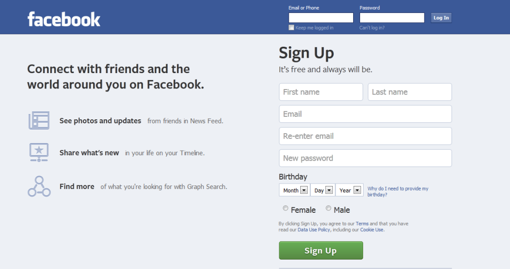
Similarly while designing Facebook, why the founder Mark Zuckerberg, came up with only Blue color? This query came to my mind when one day I was making some changes on my Facebook profile. I thought that why only blue color. Is there some deep meaning behind this decision of going with blue color for Facebook? Or it was just a completely random choice which turned out to work really well? And I am pretty sure that most of you have asked yourself the same question. So we decided to do the research and come up with an answer. And in this article, we are going to share that same answer with you as to why is Facebook blue. Also Read: How To Remove Location From A Facebook Post
What Does Blue Color Mean?
As we know that psychological impact of color is a huge factor behind the color associated with a particular brand. So now a question that comes into mind is that what exactly the Blue color represents? Well, Like Green, Blue color is also known to have a calming and relaxing impact on people. Moreover, Blue color also represents peace, so this color is one of the best choices for a global platform, which basically is connecting the whole world.
0.1 What Does Blue Color Mean?1 Why Mark Zuckerberg Was Forced To Pick Blue Color For Facebook?1.1 Role Of Colors In Marketing1.2 Final Thoughts
But is the psychological impact that blue color has on people the only reason why Mark Zuckerberg decided to go with this color? Let’s find out.
Why Mark Zuckerberg Was Forced To Pick Blue Color For Facebook?
Facebook was launched in 2004, from then onwards they have changed many features and design, but they are sticking with the blue color. They even changed the name from “The Facebook” to “Facebook,” but they didn’t change the color to gray, red, or to any other color. Not only the desktop website but also in the mobile app the color of Facebook is Blue. Well, the true reason behind the Blue color is that the founder of Facebook, Mark Zuckerberg (born May 14, 1984) has red-green color blindness and the best color he can see is Blue. The Facebook founder told The New Yorker in an interview: So, this was the secret behind the blue color of Facebook. Or to be more precise, this is the actual reason why Zuckerberg went with Blue color in the first place. And when Facebook became Big as it is today, even then they didn’t change the color because of the positive psychological impact it has on people.
Role Of Colors In Marketing
Most people think that colors associated with a brand are just picked up randomly, but that isn’t the case at all. Colors have always played a huge part in marketing a brand. But what factors are considered before selecting a particular color? Well, every color chosen by a Brand greatly depends on the psychological impact it’ll have on people. And with great impact, comes great engagement…that’s how it went, right? For instance, Green color is associated with health, tranquility, and nature. It also has a relaxing and calming psychological impact on people. So it’s no surprise that a brand like Starbucks uses green color in its logo to represent that its products are healthy and refreshing. Let’s take another one as an example, this time, one of the most popular social media app Snapchat. So, Snapchat uses yellow color for its platform and logo, now why is that? Well, the yellow color is believed to have an optimistic and cheerful psychological impact on people. So no wonder a social media app, where people try to have a good time with each other uses Yellow color. Also Read: How To See Only Unread Messages In Facebook
Final Thoughts
The Blue color for Facebook is probably the best color choice, and we don’t think anyone would question that. To be honest, we can’t even think of looking at Facebook in any other color like Red or Green. Who would have thought that a decision taken because of a sickness, will turn out to work really well?


